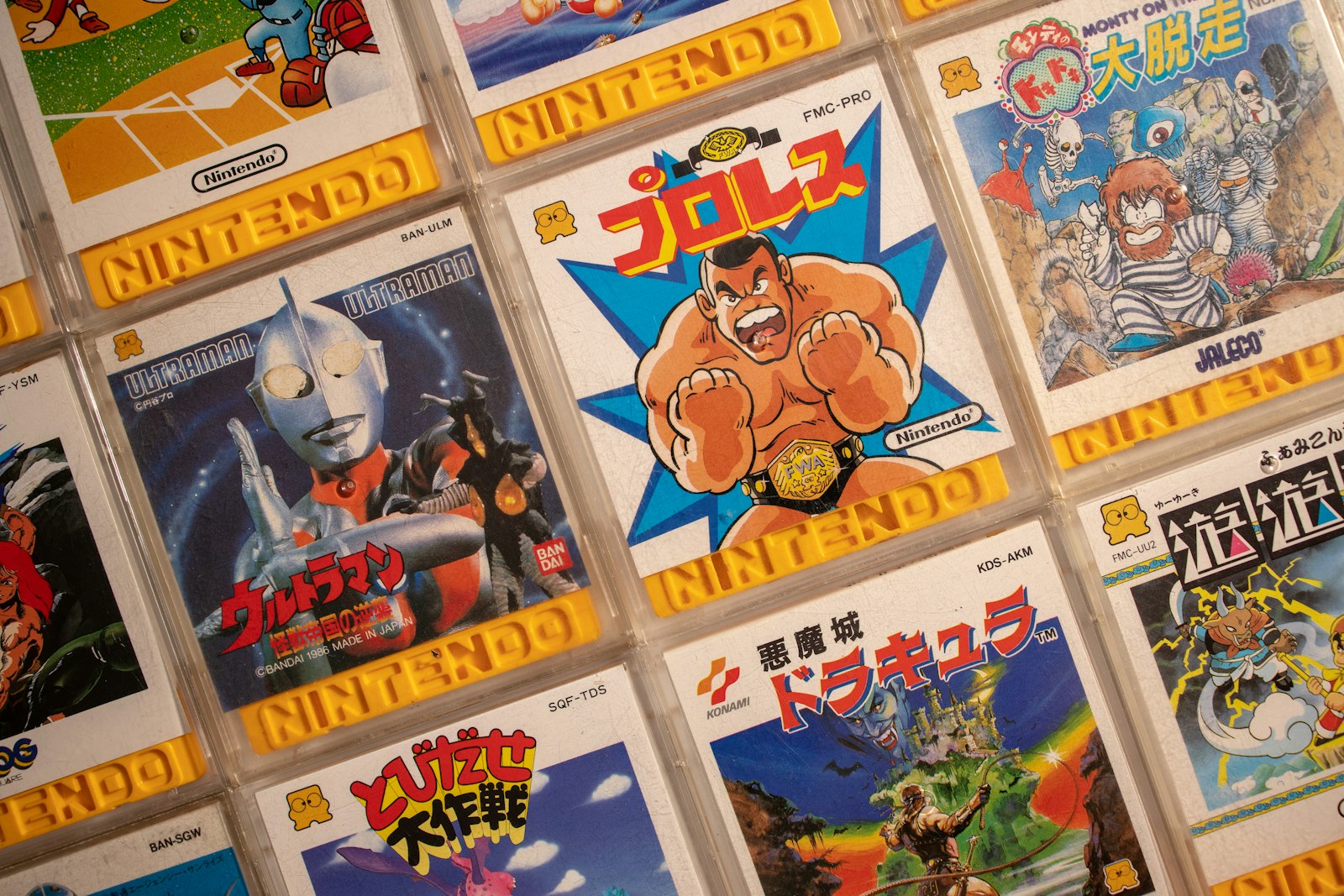
Pick up a game on Steam today and you get a 460-by-215-pixel rectangle to make your case. Blink and it's gone, replaced by the next capsule in an infinite scroll. Forty years ago, a single illustrator had one canvas, one shot, and a rack of cardboard boxes competing for the same three seconds of a kid's attention in a mall. The pressure was different. So was the art.
Video game box art doesn't get talked about the way film posters or album covers do. It should. For a solid fifteen years it was the only marketing image most players ever saw of a game before they owned it — no trailers, no Twitch streams, no gameplay footage on a store page. Just a painting, and a promise.
The Box Was the Only Trailer You Got
In 1987, if you wanted to know what Castlevania looked like before buying it, you looked at the box. That was the entire research process. A kid standing in a Toys "R" Us aisle wasn't comparing frame rates or reading reviews — they were reading a painting, the same way someone in 1955 read a pulp novel cover to decide whether to spend their allowance on it.
This produced a strange, specific kind of commercial illustration. The artist had to compress an entire game — its tone, its stakes, its main character, sometimes its plot — into one image, usually without ever playing a finished build. Studios shipped concept sketches, maybe a few screenshots, and a two-paragraph brief. The rest was the illustrator's imagination filling the gap between the pixelated sprite on the cartridge and the muscular, photorealistic hero on the cover.
That gap became famous. Sometimes for the wrong reasons.
The Redesign Nobody Asked For
Nintendo's Japanese box art in the NES and Super Famicom era leaned on cute, character-driven illustration — bright, rounded, close to the in-game sprite work. Western marketing teams routinely threw that out and started over. The original Japanese Rockman cover was a stylized, dynamic action pose. The North American Mega Man box, painted by an artist working from a brief with almost no reference material, gave the hero a bulky, static stance and a face that looked nothing like the character in the game. Capcom's own developers have called it out for decades. It's still one of the most-mocked box arts in the medium's history, and it sold fine anyway — proof that the box's job was never really accuracy. It was shelf presence.
That disconnect between "what the game looks like" and "what sells at retail" ran through the entire era. Localization wasn't just translating text. It meant repainting the pitch for a different audience, with different assumptions about what a ten-year-old in Ohio would grab off a shelf versus a ten-year-old in Osaka.
When a Cover Became the Story
EarthBound's North American box is the opposite problem: a photo collage of hamburgers, hot dogs, and a "This game stinks!" tagline, designed to be deliberately off-putting to 1995 American teenagers who Nintendo assumed wouldn't touch a game with cutesy RPG art. It bombed. Cult status came fifteen years later, largely rebuilding the game's reputation from scratch — helped, ironically, by fans who tracked down and fell in love with the same box art that killed its sales at launch. Bad marketing can become good folklore, but only with enough distance from the sales numbers that caused the damage in the first place.
Then there's the box that actually got pulled off shelves. Manhunt 2's cover for the Wii release — later censored, then softened further after retailer pushback — is one of the few times box art itself, not the game inside it, became the center of a ratings controversy. The image was doing exactly what box art is supposed to do: signal tone instantly. It signaled too well.
From Painting to Photoshop to Nothing
The tools changed the art, the same way they changed everything else in this era. Early box art was airbrushed and hand-painted — the same commercial-illustration pipeline used for movie posters and pulp paperbacks, because that's who studios hired. By the mid-90s, digital compositing took over: Photoshop layers, stock photography, 3D renders standing in for painted figures. You can watch the medium's confidence drain out of it in real time across a decade of box scans. The early stuff is weird and personal because one artist made every brushstroke. The late-90s stuff is competent and forgettable because a committee assembled it from parts.
Then the box itself started shrinking. Big N64 cartridge boxes gave way to slim jewel cases. Jewel cases gave way to nothing — a download, a library entry, a 460-by-215 capsule image that has to work as a thumbnail before it works as anything else. The audience for game art didn't disappear. It got smaller, literally, and the illustration had to compress with it. A painting that rewarded standing three feet away in an aisle doesn't work at postage-stamp size on a phone screen. So the whole visual language changed: bolder shapes, less detail, a face and a logo, done.
What Got Lost
Call it nostalgia if you want. It's also just true: nobody frames a Steam capsule and hangs it on a wall. People still frame Castlevania boxes. The painted era produced actual artifacts — one-off illustrations with a single physical original, painted by named artists (Marc Ericksen, Bob Wakelin, Susumu Matsushita, among others whose names rarely made it onto the box itself) who were solving a genuinely hard compositional problem: sell an interactive experience using a static, non-interactive medium.
That constraint is basically gone now. A modern capsule doesn't need to compress a whole game into one frozen image, because the player can watch thirty seconds of actual footage two clicks later. The problem the old illustrators were solving doesn't exist anymore. Neither, really, does their job — most current storefront art leans on in-engine renders, character portraits pulled straight from the game, or increasingly, AI-assisted composites doing the same compositing work a Photoshop artist did in 1997, just faster and cheaper.
The irony is that this happened right as digital painting tools got good enough to make that old illustration style easier than ever to produce. The skill didn't disappear because the tools got worse. It disappeared because the job it was built for — convincing a stranger in three seconds, with nothing but paint — stopped existing.